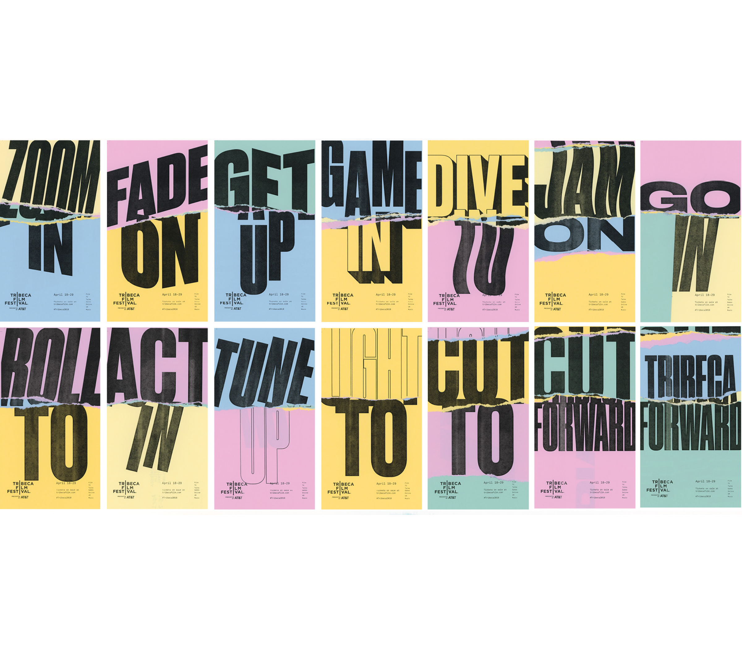
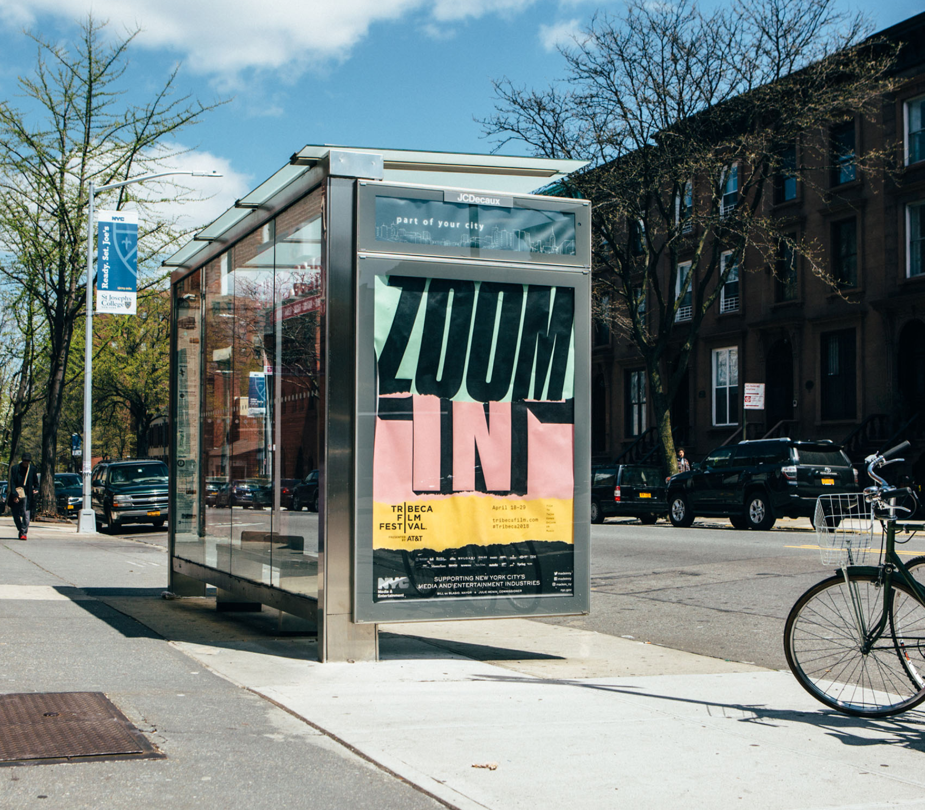
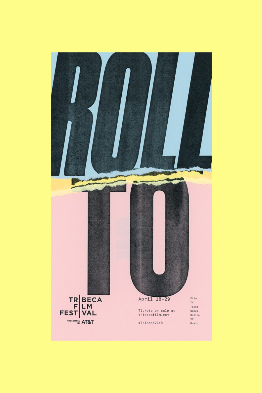
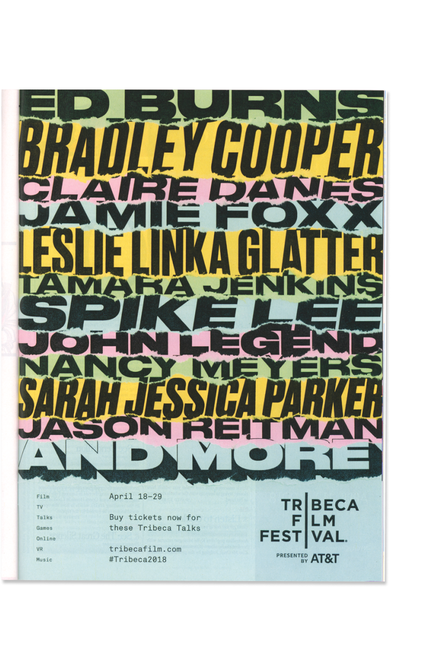
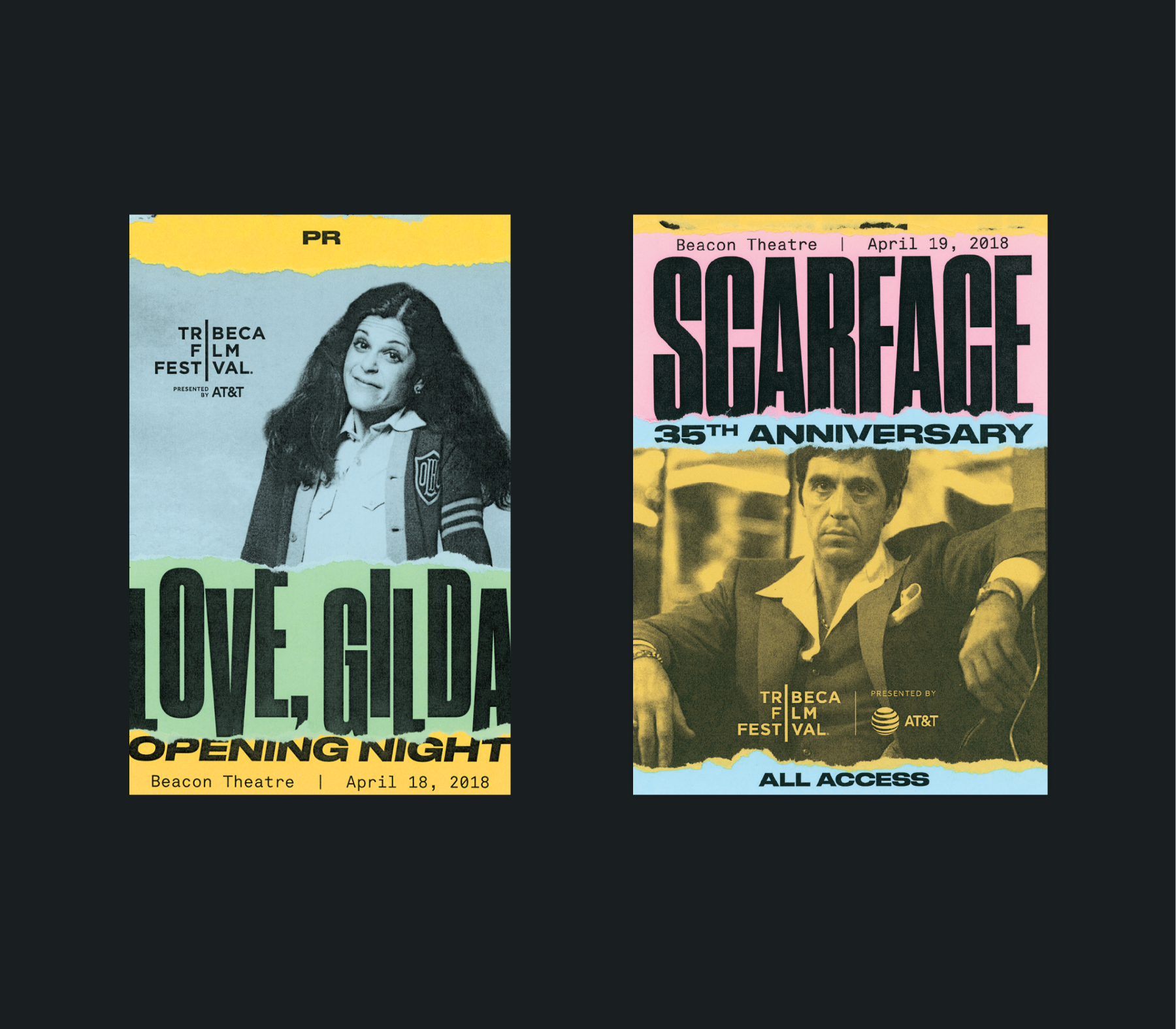
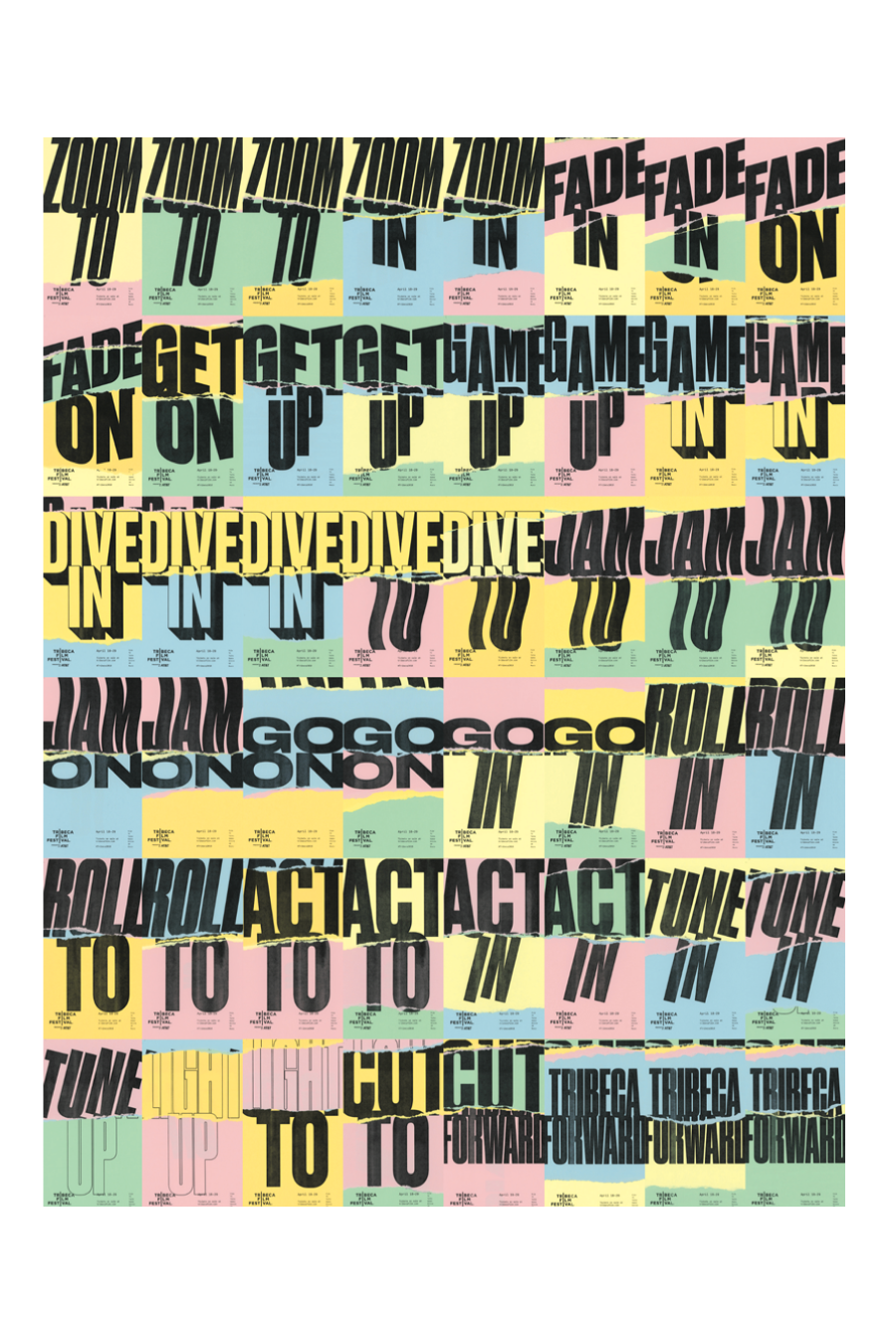
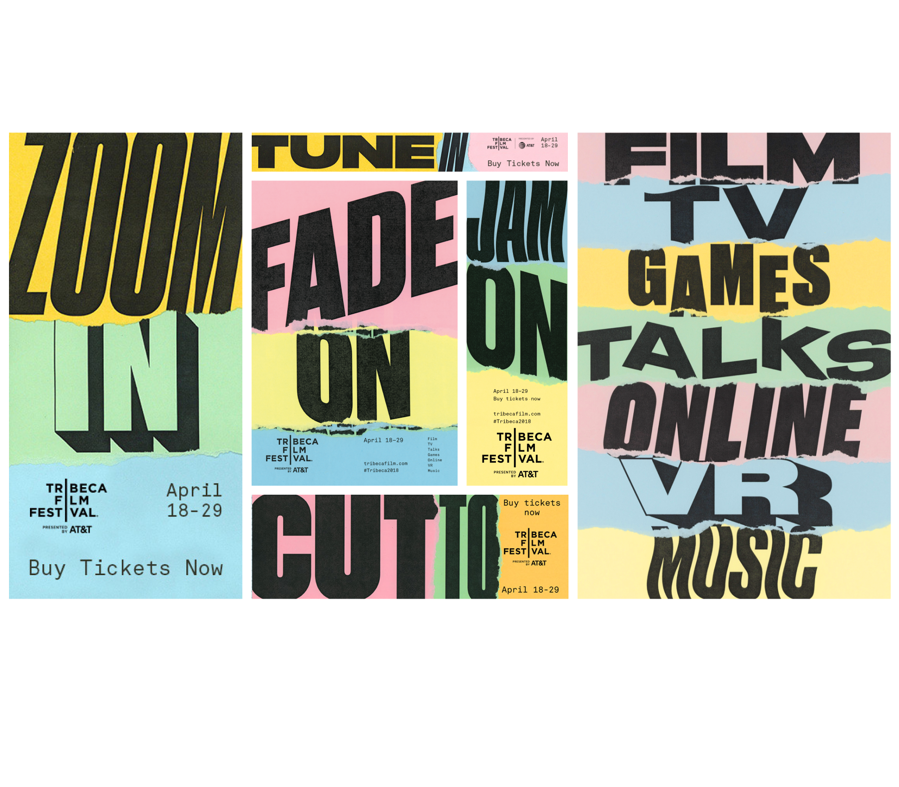
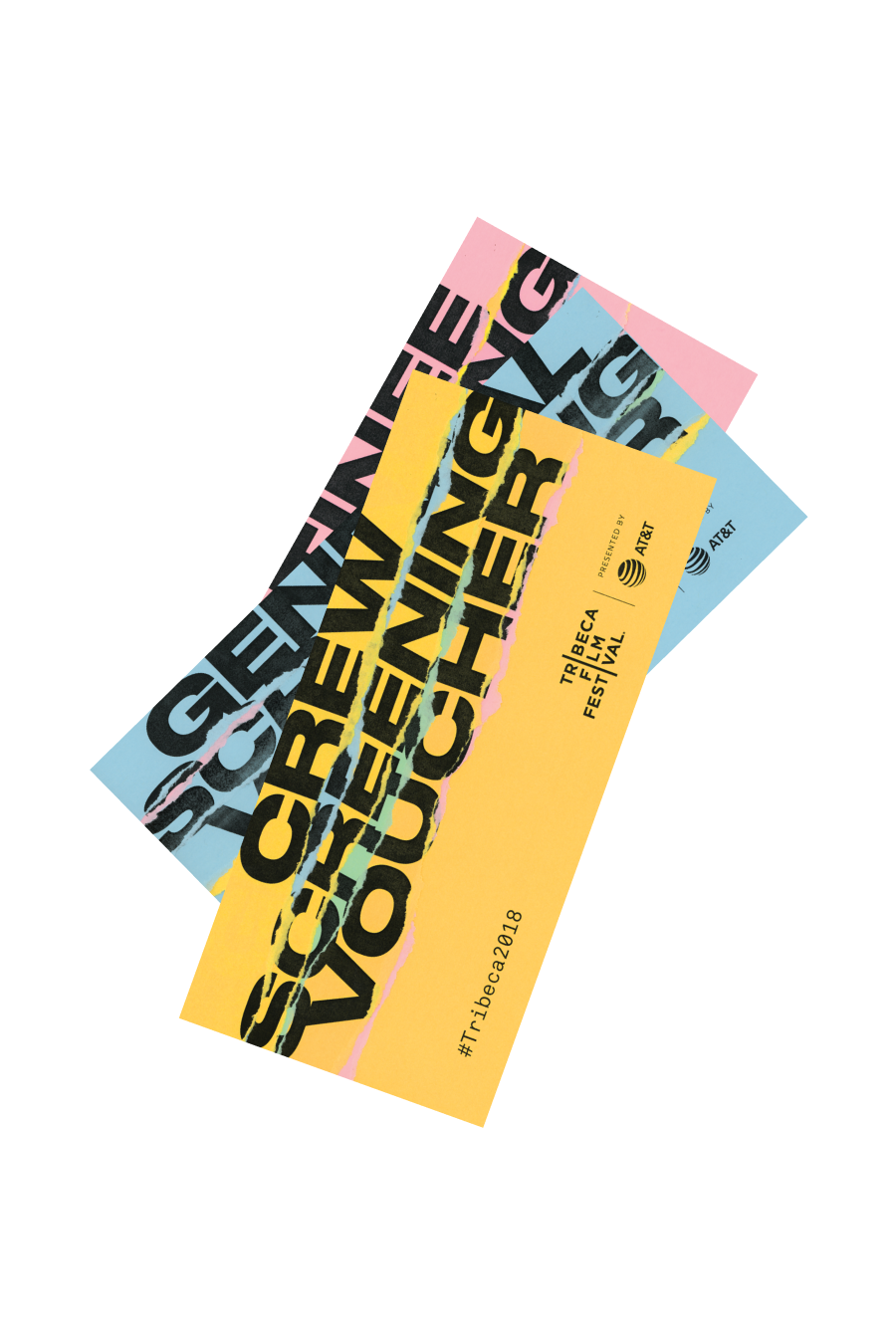
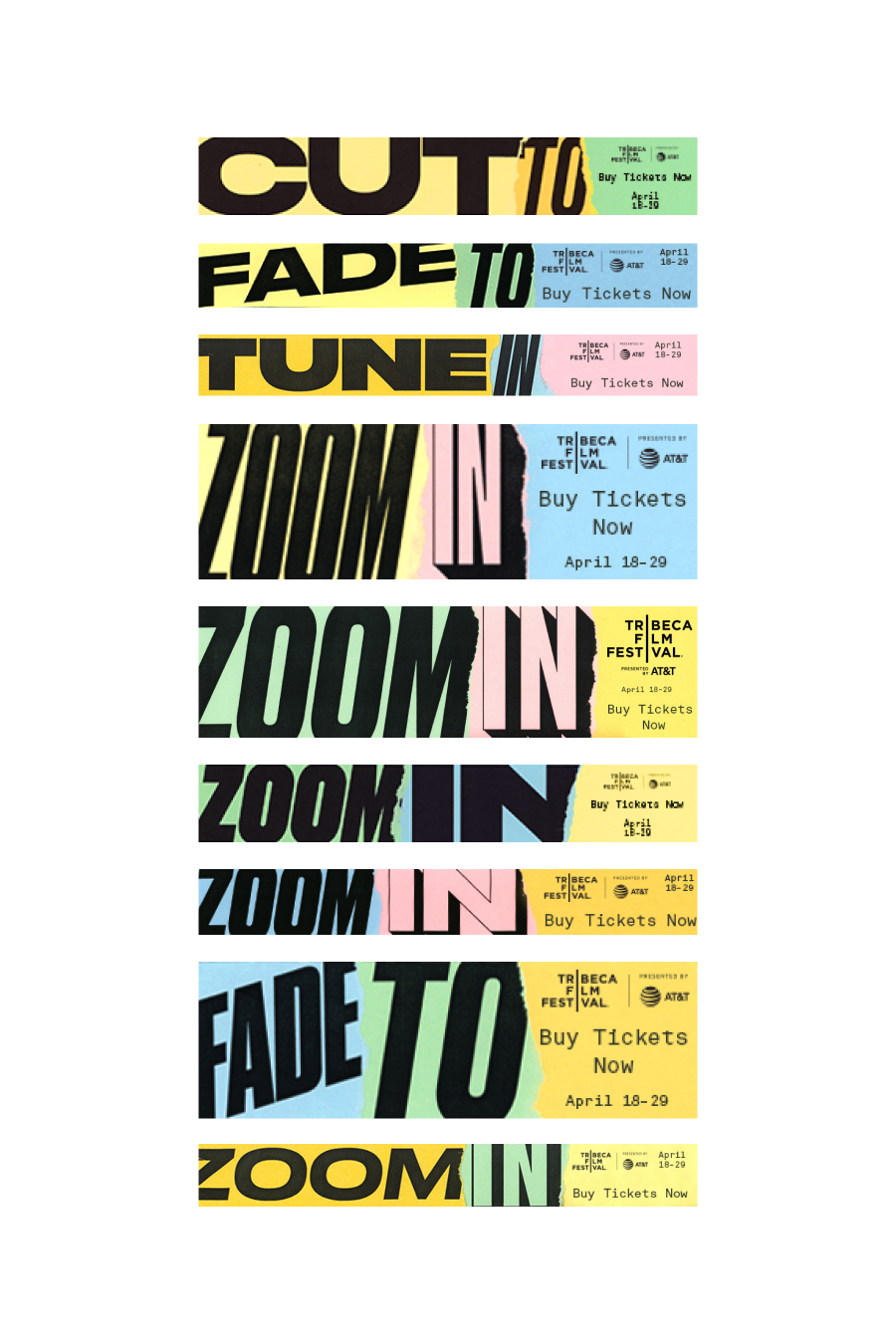
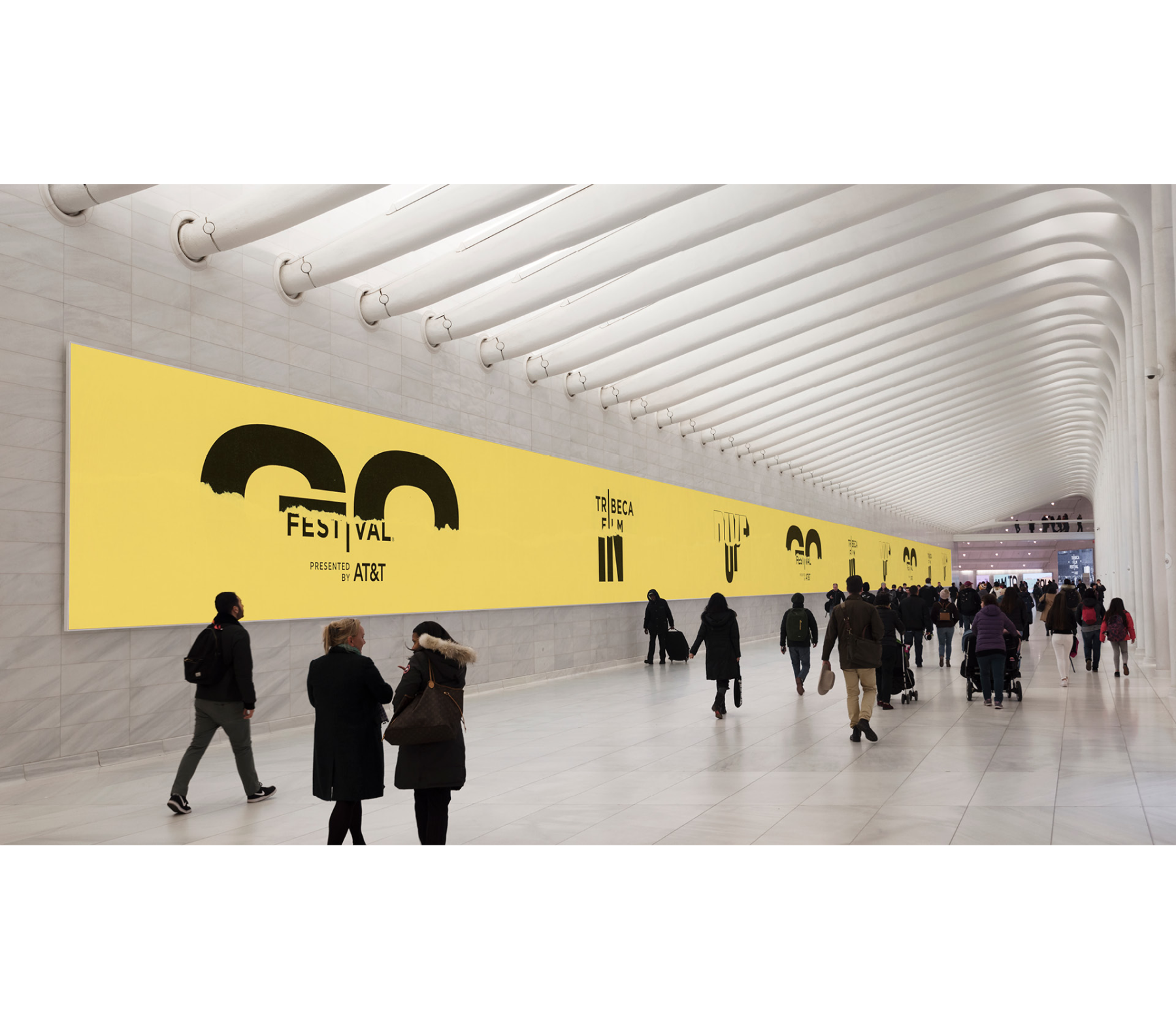
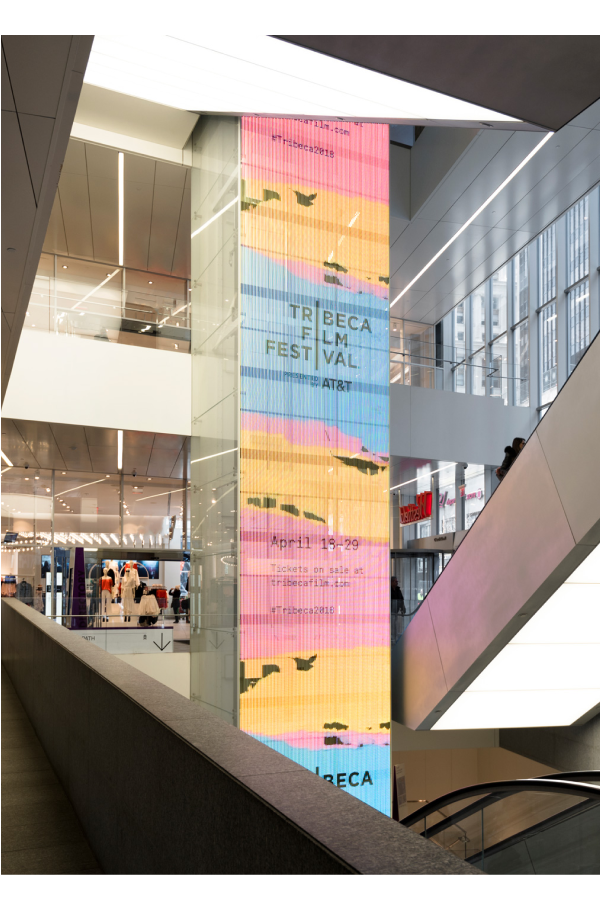
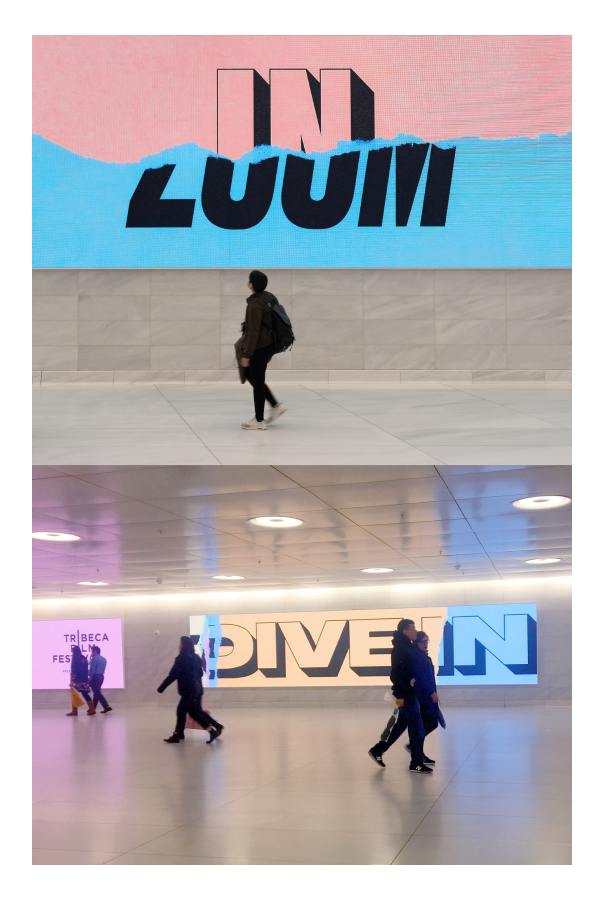
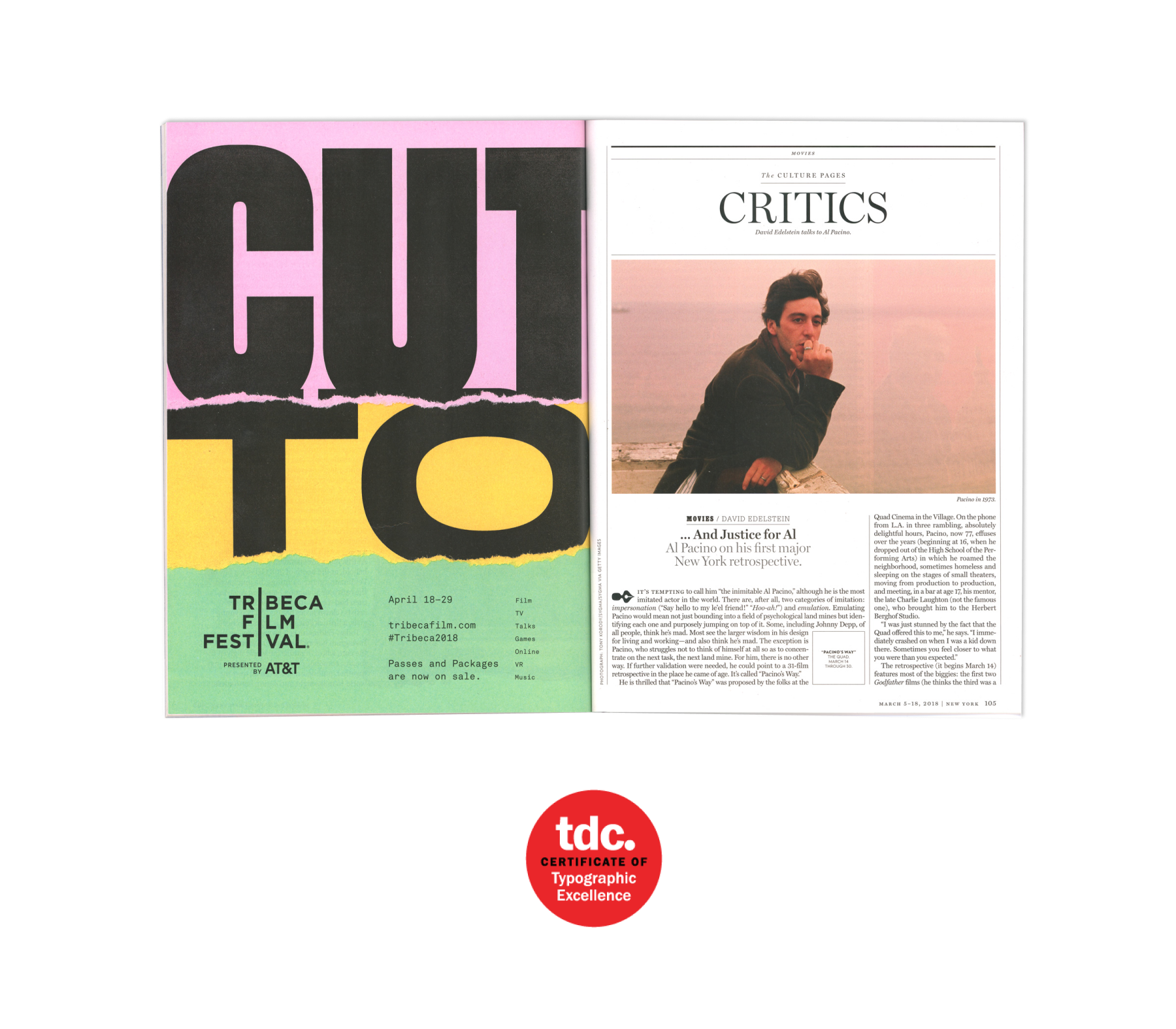
The design concept was centred on the language used in the film industry. We layered these phrases together and then tore parts of the paper to create new phrases. The mixing and matching of words emphasized the playful and energetic atmosphere which was inherint of the film festival. The visual identity of the campaign was used across varied media like printed ads in magazines, outdoor posters, screening vouchers, digital marketing, merchandise, motion ads etc. Every single piece was produced by hand.
